
Pratiman, 09 July 2020
3 min read.Usually, working with met data, you have to plot multiple figures. Here, we plot 6 plots in the same figure including plot numbers.
First of all load your dataset using xarray.open_dataset.
import xarray as xr

airtemps = xr.tutorial.open_dataset('air_temperature')
air = airtemps['air']
t = air.isel(time=slice(0, 365 * 4, 250))

g_simple = t.plot(x='lon', y='lat', col='time', col_wrap=3,
                  cbar_kwargs={'orientation': 'horizontal'})
The easiest way to plot is by using the plot function of xarray t.plot(x='lon', y='lat', col='time', col_wrap=3).
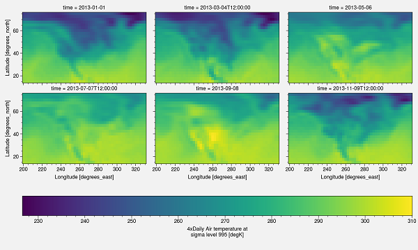
This plot has certain drawbacks. First of all, x and y labels are too small; there is no projection, and the colorbar need to be changed. You can change it to make it suitable for publishing.
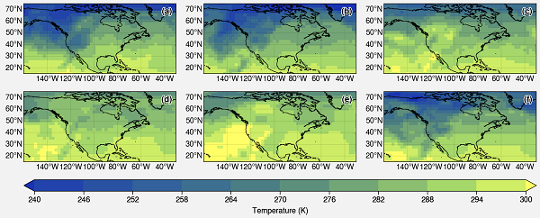
I am using ProPlot. This is an impressive library for publication-quality plots. This is the whole script and output.
import xarray as xr
import proplot as plot
import cartopy.crs as crs

airtemps = xr.tutorial.open_dataset('air_temperature')
air = airtemps['air']
t = air.isel(time=slice(0, 365 * 4, 250))

#Starting the plotting
fig, axs = plot.subplots(ncols=3, nrows=2, proj='cyl')

# Define extents
lat_min = t.lat.min()
lat_max = t.lat.max()
lon_min = t.lon.min()
lon_max = t.lon.max()

#format the plot
axs.format(
    lonlim=(lon_min, lon_max), latlim=(lat_min, lat_max),
    coast=True, labels=True, innerborders=False,
    abc=True, abcstyle='(a)', abcloc='ur')

i=0
for ax in axs:
    m=ax.pcolorfast(t[i], cmap='imola', extend='both', vmin=240, vmax=300,
                    transform=crs.PlateCarree())
    i=i+1
fig.colorbar(m, loc='b', label='Temperature (K)') #Adding colorbar with label

#Saving the Figure
fig.savefig(r'fig.png')
import xarray as xr
import proplot as plot
import cartopy.crs as crs
xarray.open_dataset and get the air variable. You can select a different variable from your file. Selecting a limited time set from the slice of first year (slice(start, end, step)).
airtemps = xr.tutorial.open_dataset('air_temperature')
air = airtemps['air']
t = air.isel(time=slice(0, 365 * 4, 250))
lat_min = t.lat.min()
lat_max = t.lat.max()
lon_min = t.lon.min()
lon_max = t.lon.max()
proj=('cyl') means the Cartopy PlateCarree projection. Number of rows and columns are 2 and 3 respectively.
fig, axs = plot.subplots(ncols=3, nrows=2, proj='cyl')
lonlim and latlim are the zoom locations of the axes. If you are using a global dataset, then you can ignore it. Turn on/off the various geographic features such as land, ocean, coast, river, lakes, innerborders, etc.. To turn on the lat and long labels use labels=True. Use of plot number in the form of a, b, c, etc.,. Position of the abc label is ur meaning upper right corner.
axs.format(
 lonlim=(lon_min, lon_max), latlim=(lat_min, lat_max),
 coast=True, labels=True, innerborders=False,
 abc=True, abcstyle='(a)', abcloc='ur')
pcolorfast. It is good enough for fast processing. pcolormesh takes a longer time to process but can be used. The colormap used is imola. For more colormaps you can check using plot.show_cmaps(). Save the figure to your deired location.i=0
for ax in axs:
m=ax.pcolorfast(t[i], cmap='imola', extend='both', vmin=240, vmax=300,
transform=crs.PlateCarree())
i=i+1
fig.colorbar(m, loc='b', label='Temperature (K)') #Adding colorbar with label
#Saving the Figure
fig.savefig(r'fig.png')