
Pratiman, 30 June 2020
3 min read.Usually, working with geographic data, you have to use GIS software. For plotting multiple plots with the same quality might be cumbersome. Hence, some people choose to automate the process; I was also struggling to do the same. So here is a simple example of plotting a GeoTIFF file.
First of all load your dataset using xarray.open_rasterio.
import xarray as xr
dem = xr.open_rasterio('https://download.osgeo.org/geotiff/samples/pci_eg/latlong.tif')
dem = dem[0] #getting the first band
The easiest way to plot is by using the plot function of xarray dem.plot().
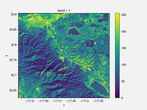
This plot has certain drawbacks. First of all, x and y labels are too small; the title is “band 1”, and the colorbar need to be changed. You can change it to make it suitable for publishing.
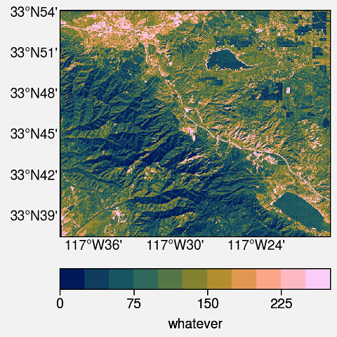
I am using ProPlot. This is an impressive library for publication-quality plots. This is the whole script and output.
import proplot as plot
import xarray as xr

dem = xr.open_rasterio('https://download.osgeo.org/geotiff/samples/pci_eg/latlong.tif')
dem = dem[0]

# Define extents
lat_min = dem.y.min()
lat_max = dem.y.max()
lon_min = dem.x.min()
lon_max = dem.x.max()

#Starting the plotting
fig, axs = plot.subplots(proj=('cyl'))

#format the plot
axs.format(
    lonlim=(lon_min, lon_max), latlim=(lat_min, lat_max),
    land=False, labels=True, innerborders=False
)

#Plot
m = axs.pcolorfast(dem, cmap='batlow')
cbar = fig.colorbar(m, loc='b', label='whatever') #Adding colorbar with label

#Saving the Figure
fig.savefig(r'geotiff.png')
import proplot as plot
import xarray as xr
xarray.open_rasterio and get the first band of the image. You can select a different band if you have multi-band GeoTIFF.
dem = xr.open_rasterio('https://download.osgeo.org/geotiff/samples/pci_eg/latlong.tif')
dem = dem[0]
lat_min = dem.y.min()
lat_max = dem.y.max()
lon_min = dem.x.min()
lon_max = dem.x.max()
proj=('cyl') means the Cartopy PlateCarree projection
fig, axs = plot.subplots(proj=('cyl'))
lonlim and latlim are the zoom locations of the axes. If you are using a global dataset, then you can ignore it. Turn on/off the various geographic features such as land, ocean, coast, river, lakes, innerborders, etc.. To turn on the lat and long labels use labels=True.
axs.format(
 lonlim=(lon_min, lon_max), latlim=(lat_min, lat_max),
 land=False, labels=True, innerborders=False
)
pcolorfast. It is good enough for fast processing of the GeoTIFF files. pcolormesh takes a longer time to process but can be used. The colormap used is batlow. For more colormaps you can check using plot.show_cmaps(). Save the figure to your deired location.m = axs.pcolorfast(dem, cmap='batlow')
cbar = fig.colorbar(m, loc='b', label='whatever') #Adding colorbar with label
#Saving the Figure
fig.savefig(r'geotiff.png')